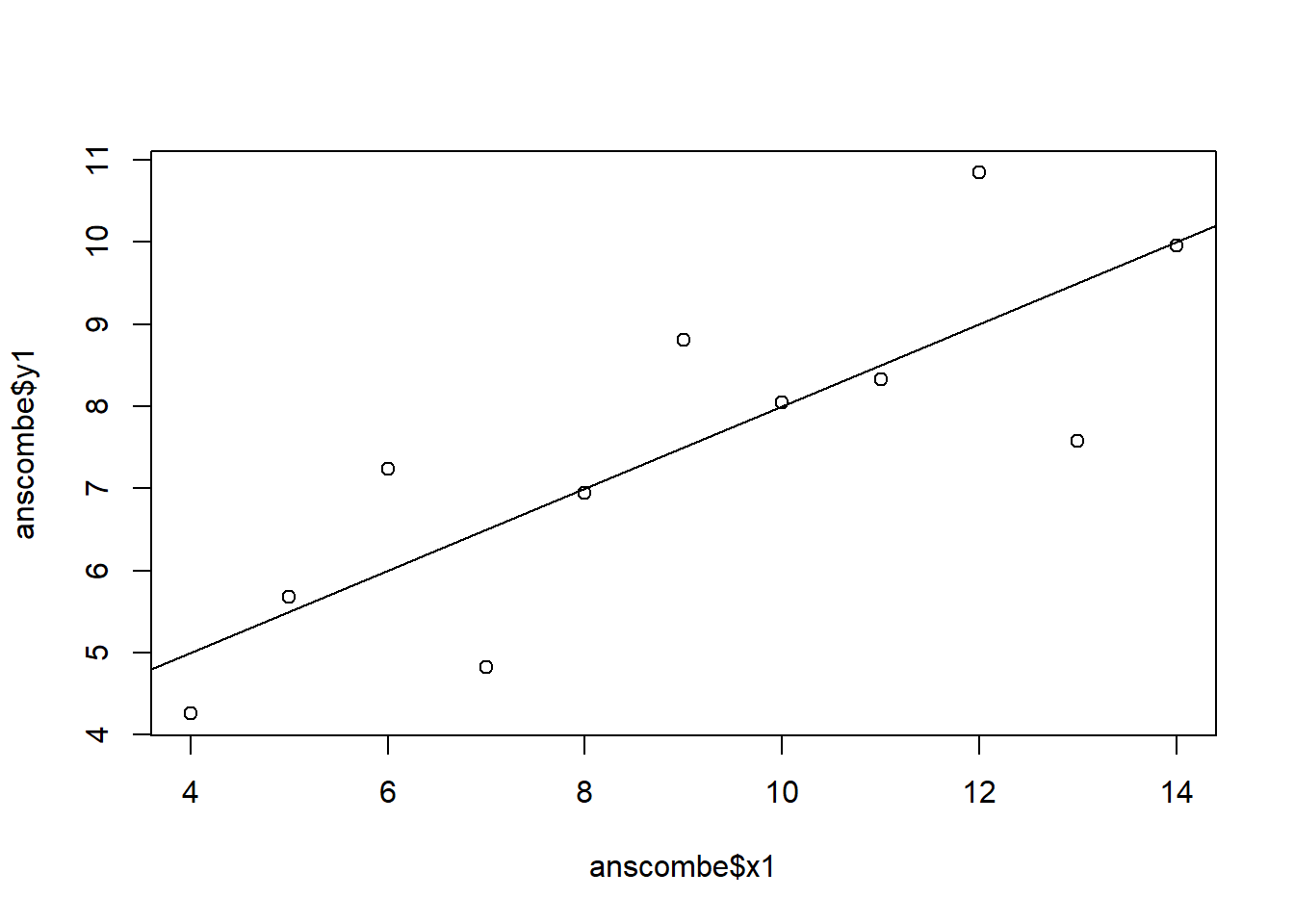
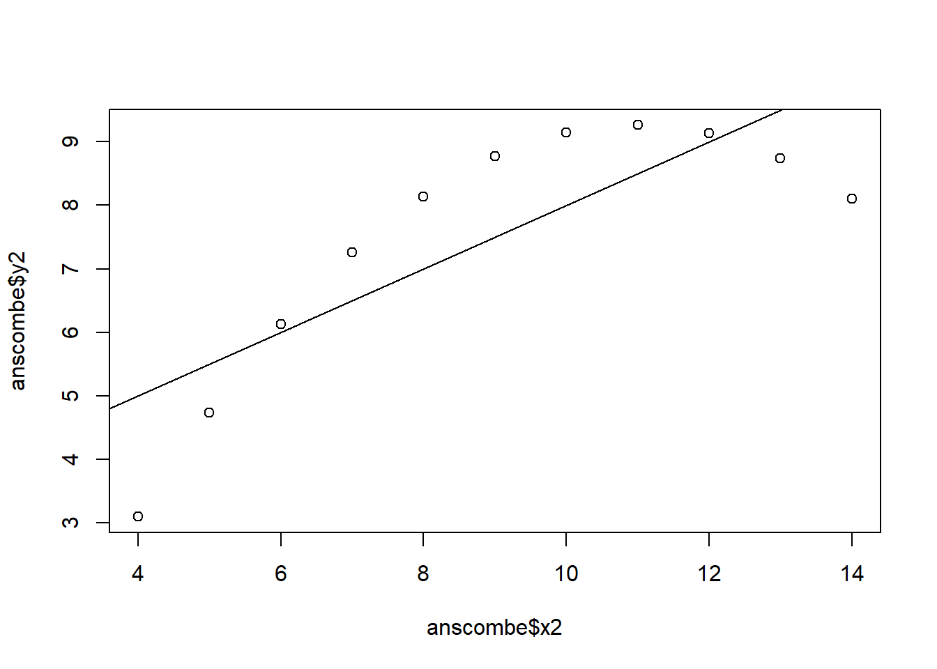
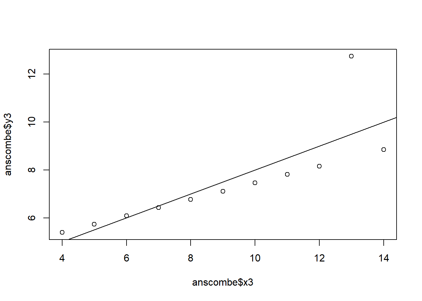
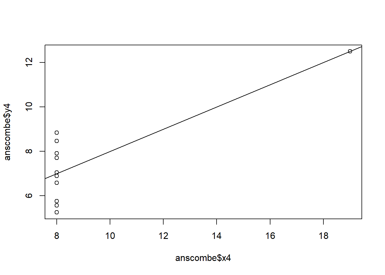
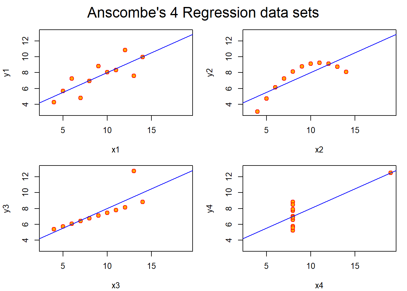
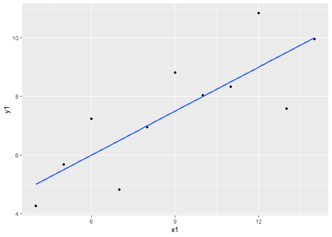
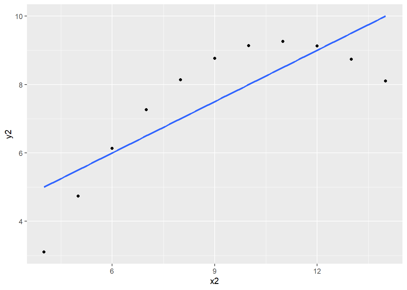
The 4 regression models are almost identical to each other even when the data is not. Plotting the data reveals that the model fits some of the variables poorly and others better. For example, the model fits y1 regressed on x1 decently well while it fails to account for the quadratic characteristic of y2 regressed on x2.
## Fancy version (per help file)ff <- y ~ xmods <-setNames(as.list(1:4), paste0("lm", 1:4))# Plot using for loopfor(i in1:4) { ff[2:3] <-lapply(paste0(c("y","x"), i), as.name)## or ff[[2]] <- as.name(paste0("y", i))## ff[[3]] <- as.name(paste0("x", i)) mods[[i]] <- lmi <-lm(ff, data = anscombe)print(anova(lmi))}
Analysis of Variance Table

Response: y1
          Df Sum Sq Mean Sq F value  Pr(>F)
x1         1 27.510 27.5100   17.99 0.00217 **
Residuals  9 13.763  1.5292
---
Signif. codes:  0 '***' 0.001 '**' 0.01 '*' 0.05 '.' 0.1 ' ' 1
Analysis of Variance Table

Response: y2
          Df Sum Sq Mean Sq F value   Pr(>F)
x2         1 27.500 27.5000  17.966 0.002179 **
Residuals  9 13.776  1.5307
---
Signif. codes:  0 '***' 0.001 '**' 0.01 '*' 0.05 '.' 0.1 ' ' 1
Analysis of Variance Table

Response: y3
          Df Sum Sq Mean Sq F value   Pr(>F)
x3         1 27.470 27.4700  17.972 0.002176 **
Residuals  9 13.756  1.5285
---
Signif. codes:  0 '***' 0.001 '**' 0.01 '*' 0.05 '.' 0.1 ' ' 1
Analysis of Variance Table

Response: y4
          Df Sum Sq Mean Sq F value   Pr(>F)
x4         1 27.490 27.4900  18.003 0.002165 **
Residuals  9 13.742  1.5269
---
Signif. codes:  0 '***' 0.001 '**' 0.01 '*' 0.05 '.' 0.1 ' ' 1
sapply(mods, coef) # Note the use of this function
$lm1
             Estimate Std. Error  t value    Pr(>|t|)
(Intercept) 3.0000909  1.1247468 2.667348 0.025734051
x1          0.5000909  0.1179055 4.241455 0.002169629

$lm2
            Estimate Std. Error  t value    Pr(>|t|)
(Intercept) 3.000909  1.1253024 2.666758 0.025758941
x2          0.500000  0.1179637 4.238590 0.002178816

$lm3
             Estimate Std. Error  t value    Pr(>|t|)
(Intercept) 3.0024545  1.1244812 2.670080 0.025619109
x3          0.4997273  0.1178777 4.239372 0.002176305

$lm4
             Estimate Std. Error  t value    Pr(>|t|)
(Intercept) 3.0017273  1.1239211 2.670763 0.025590425
x4          0.4999091  0.1178189 4.243028 0.002164602
# Preparing for the plotsop <-par(mfrow =c(2, 2), mar =0.1+c(4,4,1,1), oma =c(0, 0, 2, 0))# Plot charts using for loopfor(i in1:4) { ff[2:3] <-lapply(paste0(c("y","x"), i), as.name)plot(ff, data = anscombe, col ="red", pch =21, bg ="orange", cex =1.2,xlim =c(3, 19), ylim =c(3, 13))abline(mods[[i]], col ="blue")}mtext("Anscombe's 4 Regression data sets", outer =TRUE, cex =1.5)
par(op)
The plot function in the previous code chunk is a simple way to graph the data. However, it lacks the color, line type, and other parameters contained in the plots above. Specifically, “col” specifies the outline color of the points and the line in their respective functions, “pch” specifies the line type, and “bg” specifies the fill color of the points.
The same plots can be created using ggplot2.
library(tidyverse)ggplot(data = anscombe, aes(x = x1, y = y1)) +geom_point() +geom_smooth(method ="lm", se =FALSE)
ggplot(data = anscombe, aes(x = x2, y = y2)) +geom_point() +geom_smooth(method ="lm", se =FALSE)
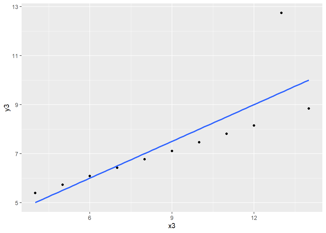
ggplot(data = anscombe, aes(x = x3, y = y3)) +geom_point() +geom_smooth(method ="lm", se =FALSE)
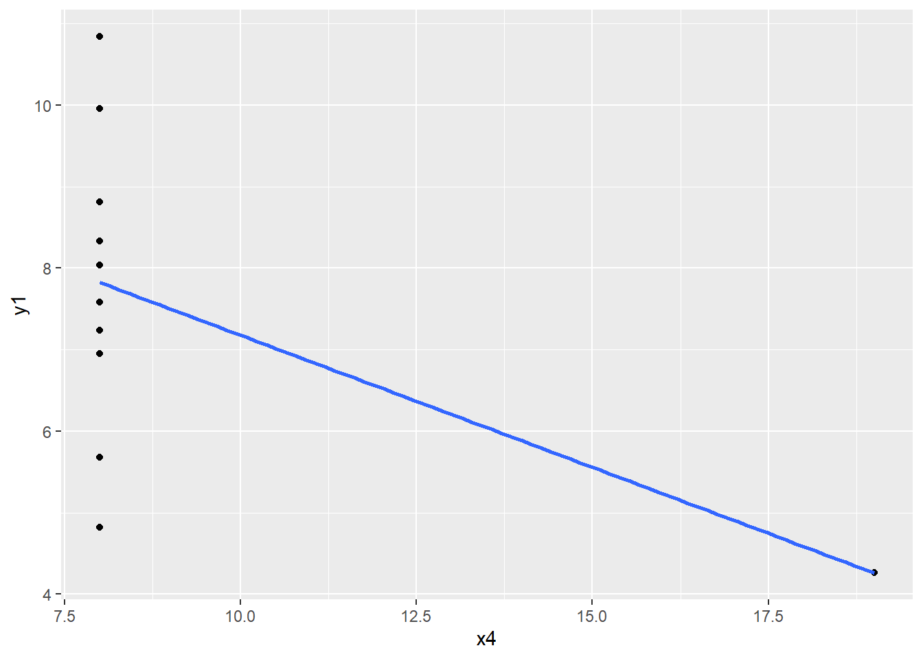
ggplot(data = anscombe, aes(x = x4, y = y1)) +geom_point() +geom_smooth(method ="lm", se =FALSE)