# Title Fall color# Credit: https://fronkonstin.com# Install packages#install.packages("gsubfn")#install.packages("tidyverse")library(gsubfn)library(tidyverse)# Define elements in plant art# Each image corresponds to a different axiom, rules, angle and depth# Leaf of Fallaxiom="X"rules=list("X"="F-[[X]+X]+F[+FX]-X", "F"="FF")angle=22.5depth=6for (i in1:depth) axiom=gsubfn(".", rules, axiom)actions=str_extract_all(axiom, "\\d*\\+|\\d*\\-|F|L|R|\\[|\\]|\\|") %>% unliststatus=data.frame(x=numeric(0), y=numeric(0), alfa=numeric(0))points=data.frame(x1 =0, y1 =0, x2 =NA, y2 =NA, alfa=90, depth=1)# Generating data# Note: may take a minute or twofor (action in actions){if (action=="F") { x=points[1, "x1"]+cos(points[1, "alfa"]*(pi/180)) y=points[1, "y1"]+sin(points[1, "alfa"]*(pi/180)) points[1,"x2"]=x points[1,"y2"]=ydata.frame(x1 = x, y1 = y, x2 =NA, y2 =NA,alfa=points[1, "alfa"],depth=points[1,"depth"]) %>%rbind(points)->points }if (action %in%c("+", "-")){ alfa=points[1, "alfa"] points[1, "alfa"]=eval(parse(text=paste0("alfa",action, angle))) }if(action=="["){data.frame(x=points[1, "x1"], y=points[1, "y1"], alfa=points[1, "alfa"]) %>%rbind(status) -> status points[1, "depth"]=points[1, "depth"]+1 }if(action=="]"){ depth=points[1, "depth"] points[-1,]->pointsdata.frame(x1=status[1, "x"], y1=status[1, "y"], x2=NA, y2=NA,alfa=status[1, "alfa"],depth=depth-1) %>%rbind(points) -> points status[-1,]->status }}ggplot() +geom_segment(aes(x = x1, y = y1, xend = x2, yend = y2),lineend ="round",color="firebrick3", # Set your own Fall color?data=na.omit(points)) +coord_fixed(ratio =1) +theme_void() # No grid nor axes
Critique
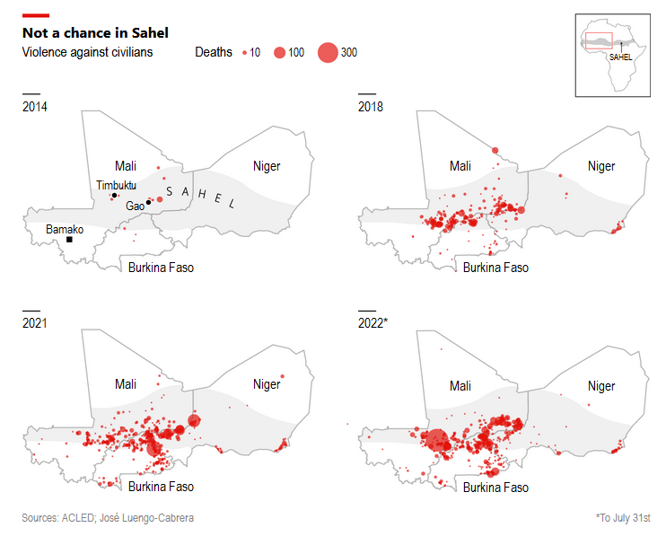
The Economist article reports on France’s exit from Mali after over nine years of intervention, and the instability that has grown in the region over time. The maps show the intensity and location of violence against civilians in the region in 2014, 2018, 2021, and 2022. They contextualize the article while being easy to interpret. Two separate graphs provide more specific details on the number of attacks. I think separating the data this way makes the article flow better without bogging the reader down.
.png)